For my film poster, I used two images. one of which I took myself and the other from sxc.hu - a website offering free royalty free images on the condition that you adhere to their terms and conditions, which I have done.
Original images:
This is the image from the royalty free image site. I really loved the colours from the image and the concert set up - it was perfect for my poster.
This is my original image. I knew that I wanted a simple hand making the 'rock and roll' hand gesture on my poster and so I took a few photos. Then I came up with the idea of having a hospital wrist band around the wrist to show the main character's medical struggle - or at least, to give some indication of it. A friend of my brothers had one which he let me borrow and so this was the image I used for my poster.
I used Adobe Photoshop CS5 to create the final poster, changing all the details on the hospital wristband, putting the images together, adding contrast and text and finally, a vignette. Here is the finished product:
Showing posts with label Ancillary Tasks. Show all posts
Thursday, 28 February 2013
Wednesday, 27 February 2013
Film Review
After finishing my shot film I set about creating my review. I took into consideration all of my research and thought about the conventions of published film reviews: large title, big main image, screenshots, small fact file about the film, text in columns and a rating and came up with the following:
Monday, 11 February 2013
Magazine Review Research
After getting the majortity of my short film done and doing research into the conventions of a documentary poster, I decided to do some research into magazine reviews. Reviews come in various styles and sizes and I wanted to understand what conventions apply to most reviews, no matter what size or style. To do this, I looked at various sizes of film reviews to see what each of them had in common.
So, after looking at various magazine reviews, I can conclude that there are certain conventions:
1) Stills from the movie - used to make the review look bolder and capture the audience's attention.
2) Large title - the title is emphasised to capture the audience's attention and easily plant the film title into their mind subconsciously.
3) Putting the review text into columns - makes the review easier to read and doesn't look like a hard block of text to read.
4) Basic details about the film - basic details like the director and actors as well as a rating to easily convey some information about the film to the audience.
5) Tagline - an easy to remember summary of the film to help an audience make a quick judgement about the film and hopefully entice them to read the review.
Monday, 17 December 2012
Analysing Documentary Posters
After looking at the conventions of a documentary, and earlier in the year looking at general film posters like 'The Dark Knight' and 'Cyrus' (See Here), I decided that I would look into and research documentary posters to discover the conventions which I could follow to create my own film poster. I looked at 'Supersize Me', 'An Inconvenient Truth' and 'March of the Penguins'.
After looking at these three posters, it is evident that there are certain codes and conventions to producing a poster for a documentary:
1) One main image - this large, main image is used to capture the attention of your viewers and usually conveys the main subject of the documentary. It is the first thing that the audience of your poster will see when they glance at your poster.
2) A large title - the title, along with the main image is probably the main thing that a viewer will see when glancing at your film poster so you have to make it stand out. The three above posters have achieved this by having large titles which contrast in colour to the rest of the poster.
3) A small tagline - a tagline allows the reader to learn of the contents of the documentary in one simple sentence and is a key selling point as to whether a person decides if they want to see your documentary.
4) A simple colour scheme - this applies to most film posters as they tend to stick to a simple colour scheme so as to look professional and not too busy to look at.
5) A block of credits - this simply details a lot of the people involved in the production and distribution of the documentary. It is usually made up of a small font and is located at the bottom of a poster. There may also be details of awards the documentary has won.
Friday, 14 December 2012
Ancillary Practice Task: Film Poster
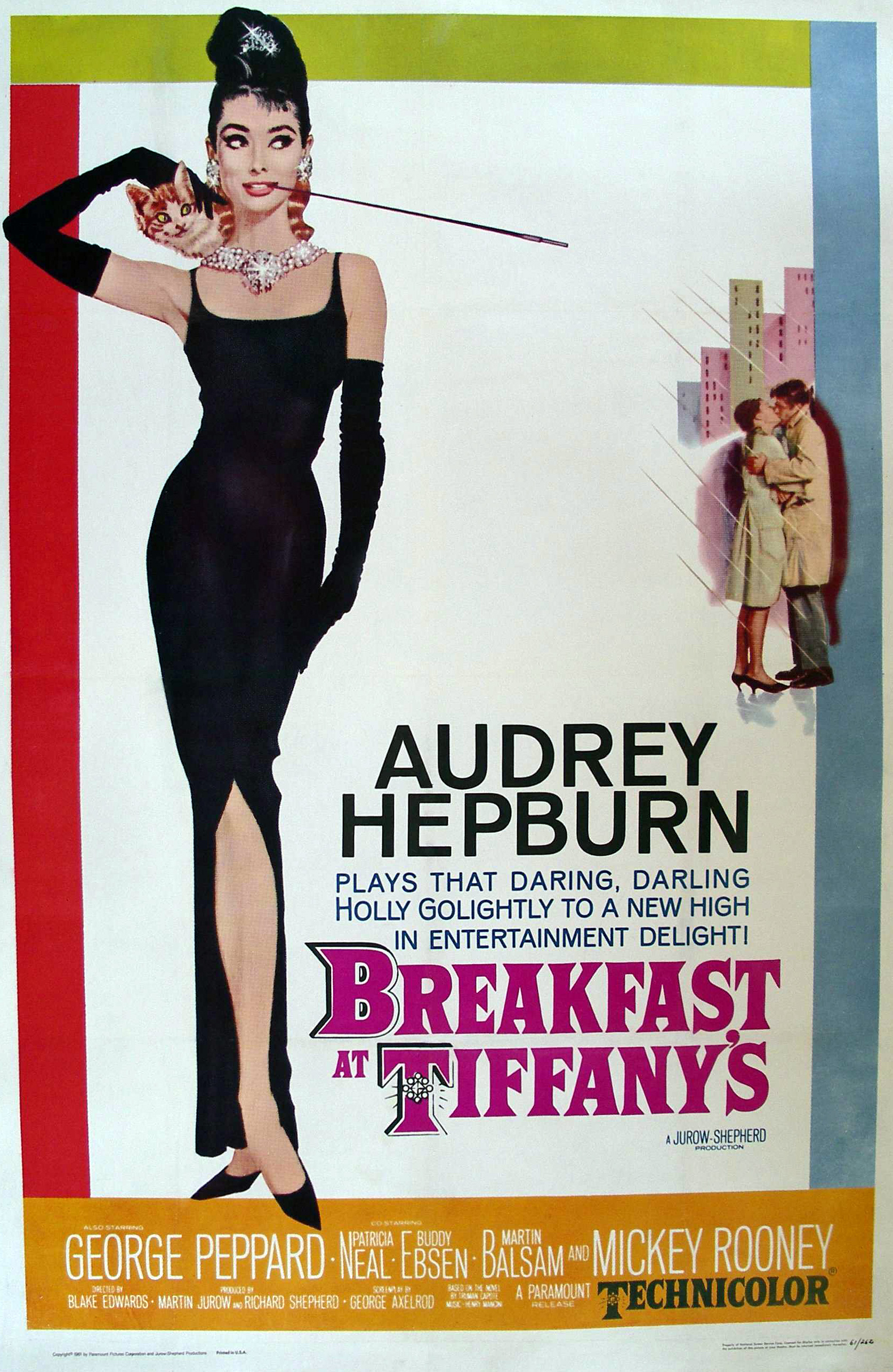
To help us prepare for completing our ancillary tasks in late January, Mr Cole set us the task of creating a film poster with original images in a week. We had to pick an era to work in: classic Hollywood, the golden age, modern - independant or modern - mainstream. I worked with Lizzie and we agreed that it would be interesting to create a film poster reminiscent of Audrey Hepburn's posters in the 1960s. We loved the high contrast, almost hand drawn looking images and how the strong black of Hepburn's dress makes her stand out from the pastel-coloured background. Immediately we had loads of ideas and settled upon doing a photoshoot and taking it from there.
Beings I had a black dress, we decided that I would be the model for the photoshoot. Lizzie swept my hair to one side and raised the volume of my hair at the back to imitate a classic 60s hairdo. Then we had to think about make-up. In our research, we had come across some pictures of Twiggy and her classic fake 'drawn-on eyelash' style and we decided to copy the style. As well as the fake eyelashes, I had silver eyeshadow and black eyeliner to create a really bold look.
Once we had taken loads of photos and decided on the one we wanted to use, we started editing. We put a high contrast onto the image but then desaturated it slightly so that it didn't look too unrealistic. We then thought about the kind of titling we wanted and ended up deciding on a hand-drawn title -which Lizzie did very well.
When putting everything together on Photoshop, we felt that the title lacked something so we ended up adding a pink colour to match that of the pink and black border that we put around the outside of the poster. We then added a slight drop shadow to give it depth, added a slogan and some other titling digitally and it was done!
Beings I had a black dress, we decided that I would be the model for the photoshoot. Lizzie swept my hair to one side and raised the volume of my hair at the back to imitate a classic 60s hairdo. Then we had to think about make-up. In our research, we had come across some pictures of Twiggy and her classic fake 'drawn-on eyelash' style and we decided to copy the style. As well as the fake eyelashes, I had silver eyeshadow and black eyeliner to create a really bold look.
![]() |
| Left: Twiggy's iconic 'drawn-on eyelash' look and Right: our take on it |
Monday, 1 October 2012
Practicing Ancillary Tasks
After finishing shooting our recreation of Ewan Torrance's 'My Beast Friend', we thought that it would be a good idea to take some original stills to use on a practice poster.
This would meant that we would get to practice the skills that we would need to complete the final ancilliary tasks after creating our short films. We took a lot of images from lots of different angles and luckily George was happy modelling for us as Fluff the cat. After importing the images, we rifled through them to find the one we preferred. I, personally, preferred this image:
So, I then set about creating a poster using this image as a base. The first thing I did was remove the dull grey background so that I just had the image of George as Fluff. then I desaturated the image of George a little and put it against a light peach background. I added text with some special effects like drop shadows and highlights, credits and a recommendation and the poster below was produced!
Subscribe to:
Posts (Atom)